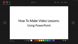
As we are faced with the Corona Virus (Covid-19) global pandemic, and in an unprecedented way people are being encouraged to work remotely from their homes and countries are discouraging social gatherings in public spaces like religious centres, stadiums, museums, theaters etc., I have decided to share a series of posts on remote (online) teaching and learning with special consideration made on the limitations that many teachers and families in Nigeria might be facing with regards to access to internet, electricity and computer system.
Video presentation of the guide
Cover slide/page:
- Subject- e.g. Maths
- Website address
- School Name
Title slide/page:
- Topic
- Sub-topic
- Lesson No
- Curriculum/Syllabus guide: e.g. WAEC, JAMB…
- Class: e.g. JSS1, 2 or 3, SSS1, 2 or3, WAEC, JAMB
- Date of preparation
- Presenter’s name & title
Slide/Page 2: Outcomes & Objectives
- Learning outcomes
- Learning objectives
Slide/Page 3: Topic
- Title: e.g. Calculus
- Introduction to main topic: e.g. what is calculus?
- Remember to provide opportunities for students’ engagement and formative assessment where and when necessary
Slide/Page 4: Sub-topic
- Title: e.g. Integration
- Introduction: e.g. what is integration…?
Slide/Page 5: Areas to cover under sub-topic (e.g. integration)
- Integration by parts
- Integration as summation
- Integration by substitution…
Slide/Page 6: Integration by parts
- Introduction: What is integration by part?
- Sample Worked examples
Slide/Page 7: Practice questions
Slide/Page 8: Solutions to practice questions
Slide/Page 9: Suggested further reading
Reading list:
- Books
- Past questions
- Websites…
Slide/Page 10: Thank you!
Remember, you can have more or fewer slides/pages as deemed necessary; this is just a guide.
The Do’s and Don’ts of slide/page design:
Do’s:
- Make use of accessible and widely available software like Microsoft Office: Power Point or Word, Google slide etc. for the slide/page preparation, and save your work in different versions.
- If you are making a handout, you can save it in both MS word and PDF formats.
- If some of your students/audience will struggle with access to high internet data/speed or computer systems, you can post the content of the slide or handout on your website for them to have direct access to it on mobile phones.
- All slides/pages should be numbered for ease of referencing.
- Use simple and legible fonts (remember the goal is for learners to learn, I would suggest Tahoma or Times New Roman).
- Use a spacing of 1.5 or 2 between bullet points or paragraphs.
- Highlight important or critical information, variables, characters, factors etc. using- colours, symbols (e.g. asterisk, hashtag), fonts, italics, shape etc.
- Design your slides to be in sync with your voice presentation (I know it takes time to master it, but it is worth the effort and the reward).
- Spell check words on your slides before using them (remember you are educating- there are many online tools you can use for this purpose, and remember your old dictionary is still very useful in this regard).
- Proofread and edit your slides for grammatical and spelling errors (consult others for assistance if necessary; remember, even renowned writers still make use of professional proof-readers and editors – no one knows it all!).
- Back-up your slides for future improvements, additions etc.
- Make your slides friendly to multiple platforms i.e. smart phones, tablets, laptops, desktop etc.
- Make use of quality video compression software to compress your video size to a more manageable size. For instance, the video uploaded above was originally 50MB but with a 66% compression using clideo.com it came down to 16MB. Remember not to compromise the quality of the video.
- Make use of voice only in your recordings and only feature yourself in the video where and when necessary, unlike what I did in the video above. For instance, major online learning platforms like Khan Academy, Coursera, Udemy and LinkedIn Learning use voice only in their lessons and only feature the presenters in course introductions, perhaps to put faces to the voices.
Don’ts:
- Avoid cluttering up your slides with too many words, images etc.
- Avoid unnecessary distractions on the slides, e.g. distracting designs, colours, fonts etc.
You can visit the links below for valuable information and guidance on delivering online/offline learning using digital technologies:
- ONLINE LEARNING in schools and higher education: WHAT WE HAVE LEARNED IN 30 SUCCESSFUL YEARS
- Best evidence on supporting students to learn remotely
- Build a Collaborative Classroom with Microsoft Teams
- A Remote Chance of Learning
- Daisy Christodoulou on remote learning
- What does the research say about designing video lessons?
I want to say that these are suggestions and they are not set in stone. I wish you best of luck with whatever decision you make with regards to your students’ or children’s education in this very trying period in the history of humanity. At Edusounds, we hope you and your loved ones remain safe and healthy, and please adhere to the advice given by the medical experts and institutions in your place of abode. We pray for Allah’s mercies and forgiveness in this very trying time.


This I Find Immensely Useful. Thanks So Much